Hi Martin,
Not a problem, trust me! Paul always likes small demonstrator programs, and he doesn't have time to retype things - and most of us don't have other language keyboards!
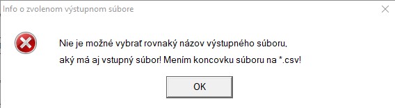
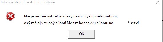
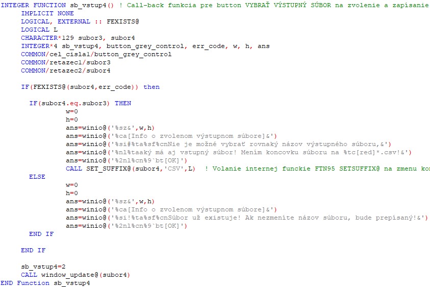
The standard icon you have chosen is the one for what is probably an irrecoverable error so the information (i) or warning (!) icons are more relevant.
Since you are changing the file extension, you could always put the completed name on a third line, which will resolve your problem temporarily.
The Windows UI guide says to always use an action word on buttons, so it is probably 'Accept' (in Slovak) rather than 'OK' although OK is simple and short and international. What happens if the user isn't happy with that? There is currently no way out except to accept the change. If the user is not content to accept the change, the dialog needs a 'Reject' button, which should take him back to the dialog where he can choose a different file name. It is also a good idea to have an audible warning 'beep' for such dialogs, but make it so that the user can switch off audible warnings in the Options or Settings window.
It is details like this that make the application much more usable and professional looking.
In Windows 10 the current advice is to make the buttons right justified, not centred. The buttons are typically less tall, which you can get with a different button format code (i.e. not %bt). I think that the dialogs look good if you put a line under the information and above the buttons with %bx, but that is what I like. I also put my standard icon in its own %ob - %cb and the text in another, then it is easier to make the standard icon lower.
I hope some of this is useful.
Best regards
Eddie